
Print & Label Clarity guide
How Do We Approve Foil on Textured Beauty Paper?
A digital gold logo can look perfect on a textured-paper mockup. The physical result may lose fine detail or change the feel of the surface.
We approve a textured paper foil proof on the intended stock with the intended process. We compare final-size detail, coverage and the assembled appearance. We retain the accepted physical sample and record its limits, so a paper swatch or screen render does not become a production guarantee.
At Finer Pack, we would use the following questions when a beauty brand chooses tactile paper. We focus on approving a specific paper-and-foil combination after the broad finish direction is chosen.

Which Paper and Foil Process Are We Approving?
A color name does not identify a paper surface. A sample stamped by another process can also answer a different question from the production brief.
We identify the exact paper, surface, foil reference and application method. We include any printing or coating below or above the foil. We ask the converter to confirm the sample route, then state which production details the sample does and does not represent.
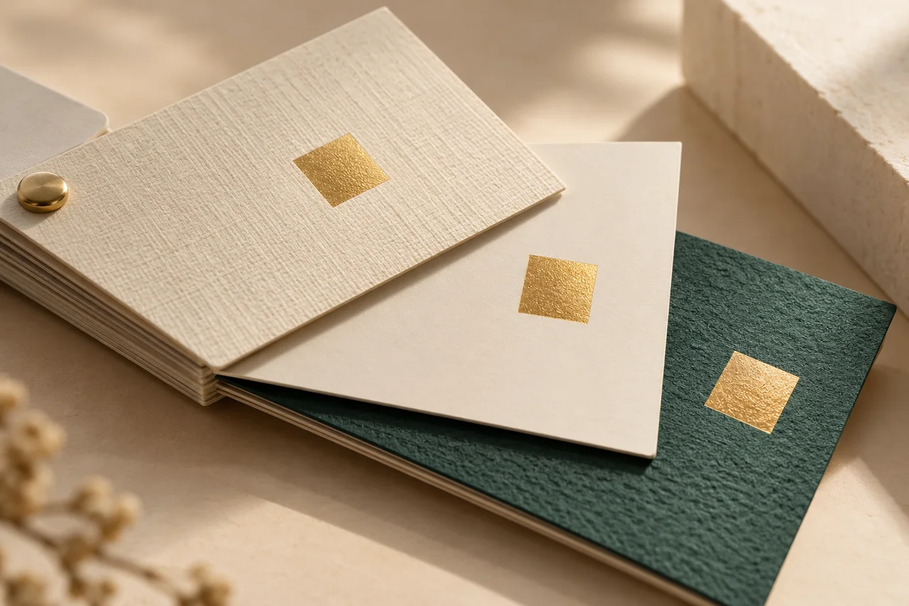
We make the material and process identity explicit
We start with the paper reference rather than a descriptive label such as linen or soft touch. We record the supplier, grade, color and relevant weight or thickness. We also note which side will face out and whether the texture has a visible direction. Two green papers can feel similar in a photograph while presenting different surfaces to a foil process. We keep the physical swatch with its identity, so a later discussion does not depend only on a filename or a screen color.
We ask how the foil will be applied. Hot stamping, a digital foil route and a printed metallic effect are different processes, even when a mockup uses the same gold color. Foilco’s primary guide explains that substrate, foil type, machinery and design detail matter to selection. We use that guidance to request the converter’s proposed combination. We do not prescribe a universal temperature or pressure. The person running the equipment should establish suitable conditions for the exact paper and intended design.
We describe the complete surface sequence. Printed ink, a coating or another treatment can sit beneath the foil. A later fold or wrap can also change the finished appearance. We would include these steps in the sample brief rather than approving foil on an untreated loose sheet when the box uses a different stack. If a sample omits a step, we label that limit. It may still help choose a shade or compare a motif, but it cannot establish the omitted interaction.
We use Fedrigoni’s technical notes for one embossed pearlescent label stock as an example of why exact product guidance matters. Those notes discuss pressure adjustment and suitability checks. They apply to that named label construction, not every textured carton wrap. We would obtain the relevant advice for our chosen stock and ask for a matching proof. This keeps a useful manufacturer example within its actual scope and avoids turning the existence of a product data sheet into approval of a different beauty pack.
Sources for this section: Foilco: foil application guide1, Fedrigoni: named textured label-stock notes2, Finer Pack: finish comparison4
Related decision: Choose the broad finish before approving the exact proof
| Review point | What we record | Decision |
|---|---|---|
| Paper | Supplier, grade, side and texture | Match the actual stock |
| Foil route | Reference and application method | Confirm with converter |
| Surface stack | Ink, coating and later steps | Record sample limitations |
What Should We Check at the Final Artwork Size?
An enlarged proof can hide the loss of a small letter opening. A large foil square does not show how a fine logo will reproduce.
We include the actual final-size motif and its smallest useful details. We compare coverage, edges, spacing and surface impression under agreed viewing conditions. We review fine lines and solid areas separately, then revise the artwork or process if the result misses the agreed reference.
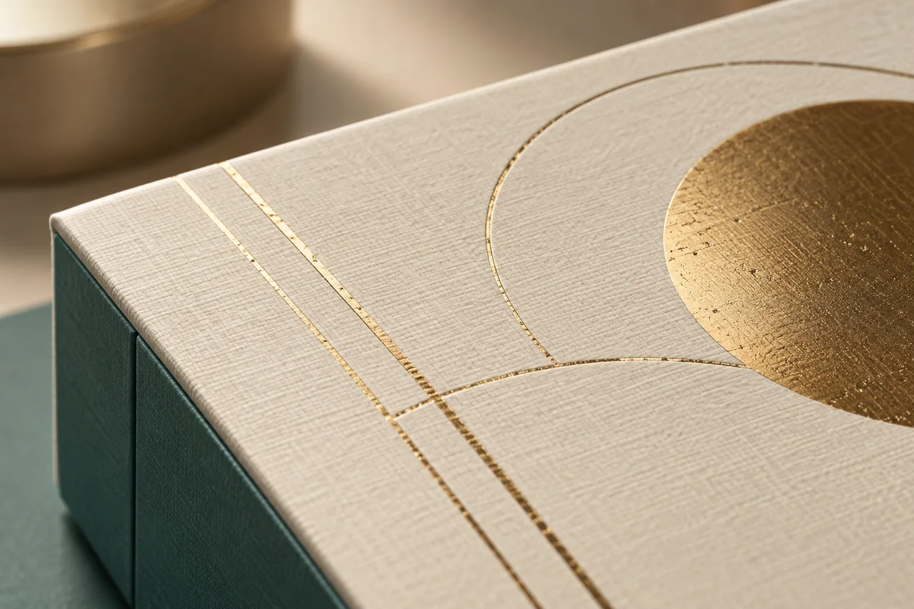
We compare the details that carry the brand
We build the proof around the real design rather than an unrelated decorative pattern. We identify the smallest text, narrowest gap and largest filled area that matter to the brand. We ask whether each is part of the approval question. If the design is still open, we can compare a small set of purposeful alternatives, but we label them clearly. A larger logo should not silently replace the intended size just because it is easier to reproduce on the selected paper.
We view the result at a normal reading distance and then inspect the relevant details more closely. We look for missing coverage, joined edges and changes in the spaces within letters. We also turn the sample under the agreed lighting because a metallic surface changes with the viewing angle. We keep those observations separate from color approval. A foil shade can be acceptable while a fine line is incomplete, or the detail can be clear while the reflection is wrong for the intended presentation.
We found an r/CommercialPrinting discussion about metallic details and a requested linen-like card stock. The original poster described a mismatch between the requested material and the received print. This is an adjacent commercial-print example, not evidence about cosmetic-carton defect rates. We use it to sharpen our own proof brief: name the stock, show the placement and explain what the sample is meant to approve. Community terminology can vary, so the converter’s written process description remains more useful than a casual finish name.
We compare corrections one at a time where practical. If coverage is poor, the converter may review the foil grade or process conditions. If a detail is too fine for the agreed route, the designer may propose a revised line or spacing. We record which input changed and compare the next proof against the same target. We do not accept a better-looking result without checking whether it also changed the paper feel or the back of the sheet. The goal is a controlled choice, not an unexplained best sample.
Sources for this section: Foilco: foil application guide1, Reddit: metallic details and linen stock3
Related decision: Prepare controlled final-size artwork
| Review point | What we record | Decision |
|---|---|---|
| Fine details | Small text and open gaps | Review at actual size |
| Solid areas | Coverage and surface impression | Inspect under agreed light |
| Placement | Motif against panel edges | Check assembled relationship |
How Do We Keep the Accepted Proof Useful in Production?
A loose foil swatch can be approved and then disappear into a folder. The next team may receive only a photo with no process identity.
We retain the accepted physical proof with its stock, artwork and process references. We also check the assembled carton or wrapped box. We define acceptable observations and review triggers, so a later paper, foil or construction change cannot inherit approval without a relevant check.
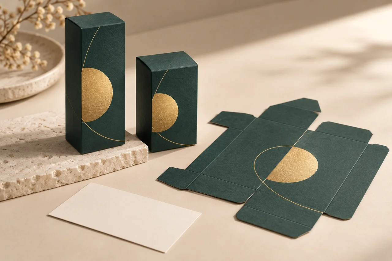
We retain the reference together with its limits
We distinguish a finish proof from a complete packaging sample. The proof can show a specific foil result on a sheet. The assembled sample shows where that result sits after folding, wrapping and joining. We would review both when those steps affect the visible motif. A logo near a fold may appear centered on a flat drawing but move visually when the box is closed. We compare the real panel edges and opening direction before recording final placement acceptance.
We keep the sample identity close to the physical object. The record names the paper, foil reference, artwork version and sample date. It states whether the result used the intended process and which later steps were included. We avoid relying on a photograph alone for metallic appearance. A photo can help locate a detail, but lighting and a screen can change how the foil looks. We keep a physical reference accessible to the people making and inspecting the job.
We agree the appearance review with the responsible quality team. We might identify a visible coverage gap or a filled letter opening as something that needs a decision, but we do not invent a universal defect limit. If handling resistance matters, we request a suitable method and record the conditions. A short bench demonstration is not proof of performance through shipping or shelf life. We keep the finish decision separate from the package’s transport, material and safety reviews, each of which answers a different question.
We also define when to revisit the reference. A paper substitution, changed texture direction, new foil grade, revised motif or different coating can alter the combination that was approved. We ask the supplier to flag those changes before using the previous sample as a match. For a reorder, we compare the current inputs with the retained record and review any differences. We can then explain exactly what the brand approved, what remains open and which evidence supports the next production decision.
Sources for this section: Finer Pack: sample selection5
Related decision: Keep finish and complete-pack sample approvals distinct
| Review point | What we record | Decision |
|---|---|---|
| Flat proof | Stock, foil and artwork identity | Retain physical reference |
| Assembled pack | Folded placement and surface | Approve complete appearance |
| Reorder change | Material or process difference | Review affected result |
Sources and Related Reading
- 1 Foilco: foil application guide. Primary foil-supplier guidance on substrate, process and design detail; not a result for our proposed pack.
- 2 Fedrigoni: named textured label-stock notes. Primary example for one label stock; its suitability notes do not approve a different carton wrap.
- 3 Reddit: metallic details and linen stock. Attributed adjacent print discussion; not a cosmetic-packaging failure survey.
- 4 Finer Pack: finish comparison. Related decision before choosing a specific finish proof.
- 5 Finer Pack: sample selection. Related guidance on the limits of different sample types.
Conclusion
We approve the exact paper, foil route and final-size design together. We retain the physical reference and revisit it when the approved combination changes.