
Finishes guide
Should I Use Foil, Embossing, or Spot UV on My Packaging?
Premium finishes lose their value when every surface competes, fine details break, or the chosen paper hides the effect.
We use foil for controlled metallic contrast, embossing for tactile relief, and spot UV for local gloss against a matte surface. We choose one effect from the message hierarchy, paper, artwork, and production tolerance. One clear focal finish usually works better than several competing effects.
We separate visual purpose, material response, and production control before we decide which finish deserves the budget.
What Visual Job Does Each Finish Do?
A finish chosen only because it looks premium can become decoration without hierarchy, meaning, or enough contrast to notice.
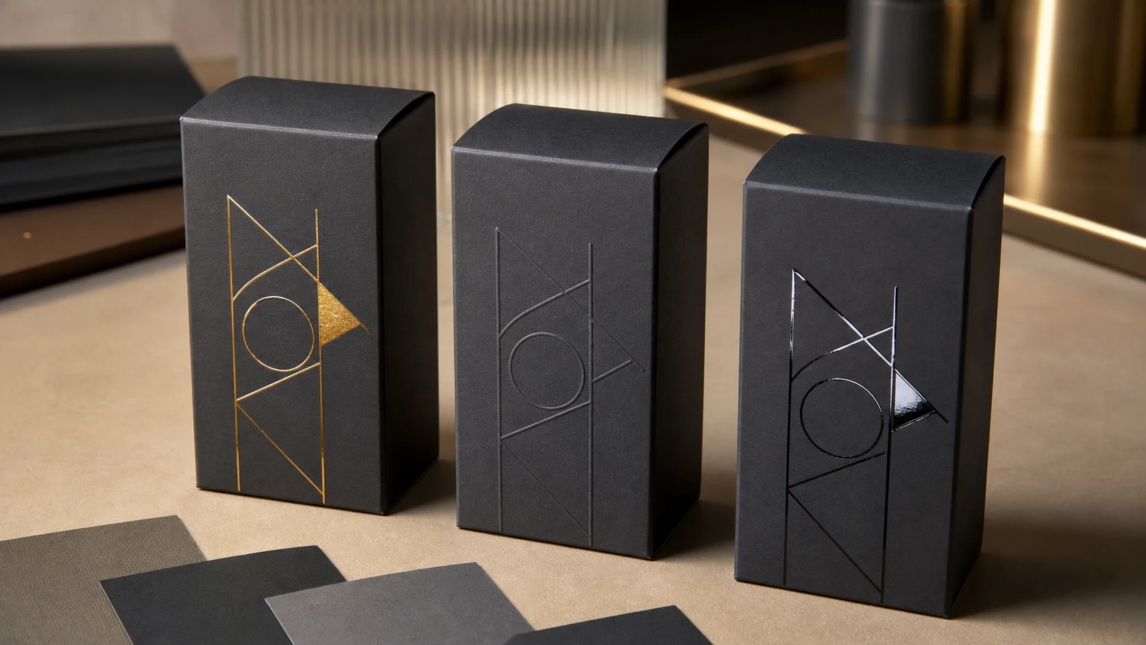
We use foil to catch light, embossing to create touch and shadow, and spot UV to change surface gloss. We assign the finish to one priority, such as the logo, product name, or pattern, before we review cost.
We match the effect to one message
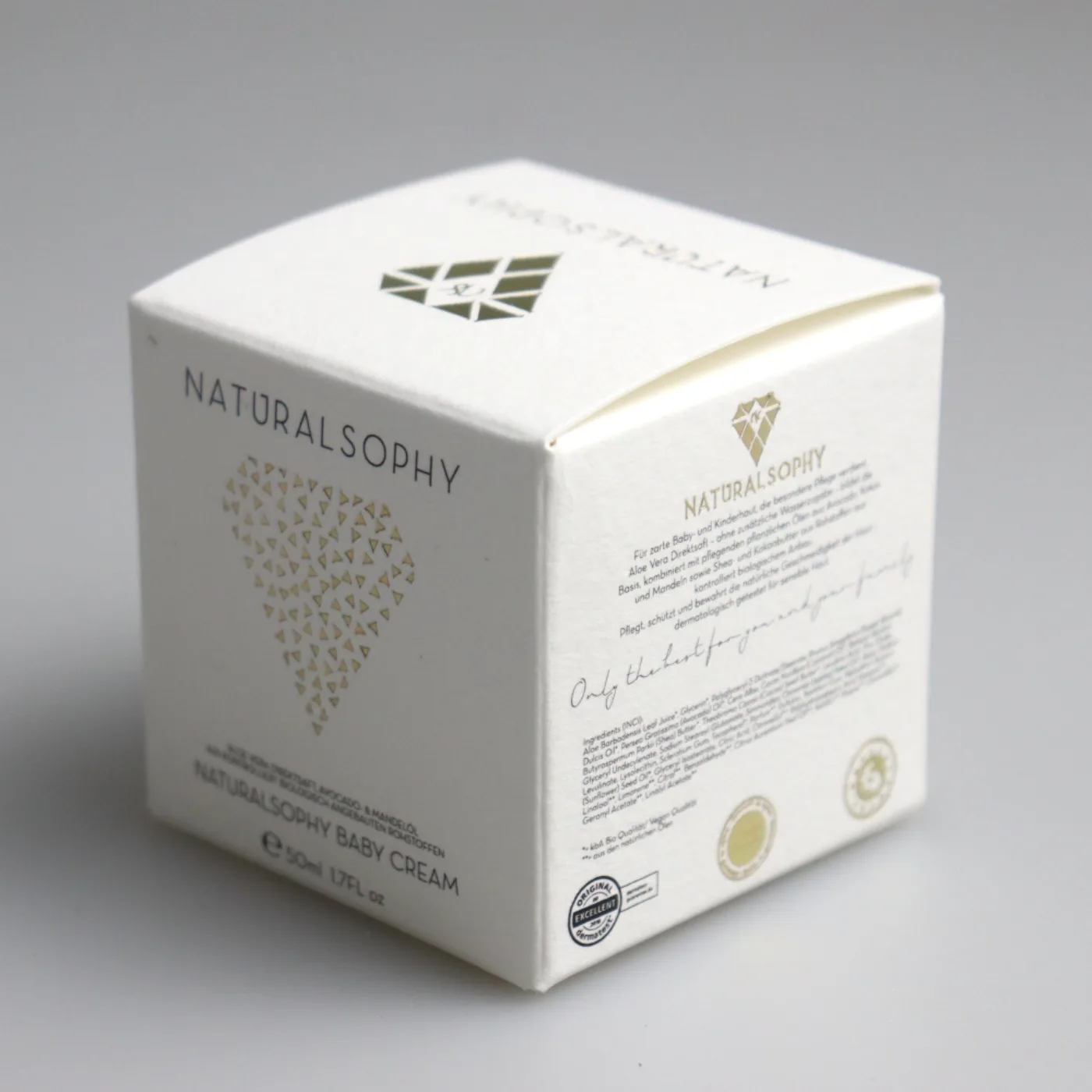
We begin with the viewing distance and lighting. Foil creates a strong change as the pack moves, so it can make a small mark visible on shelf. It can also disappear at one angle or look loud across a large area. We use it where controlled reflection supports the brand. Embossing changes the paper shape. A blind emboss can feel quiet because it uses no added color, but it needs enough relief, board strength, and open detail to read. Spot UV creates gloss contrast. It works best over a matte or low-gloss surface. On an already glossy pack, the same effect may be hard to see. We print the artwork at final size and mark the one element that should win. If the logo and pattern both need attention, we change scale or tone before we add a second finish. The finish should support the hierarchy that already exists.
We also consider touch. Customers may hold a box for only a few seconds, but a raised mark can guide a thumb and make the surface feel deliberate. We do not assume touch always means luxury. A rough uncoated sheet and a clean deboss can feel honest and material-led. A mirror foil can feel technical or celebratory. A gloss pattern can feel modern when it appears only under light. The effect depends on the whole system. We therefore review paper color, print density, coating, and finish together. We avoid using a finish to repair weak typography or a crowded front panel. If the uncoated proof does not have a clear order, the finished proof will still be unclear. The premium result comes from proportion, restraint, and accurate production, not from the number of processes listed on a quotation.
How Do Paper and Artwork Change the Result?
Fine foil can fill in, embossing can flatten, and spot UV can vanish when the substrate and artwork fight the process.
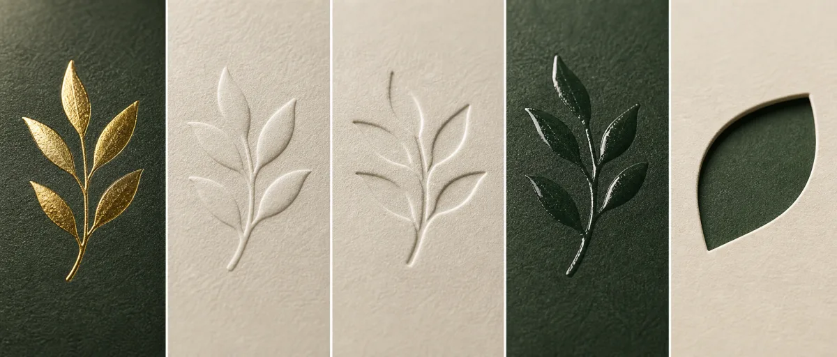
We select the paper and base print before we finalize finish artwork. Smooth coated sheets support fine foil and UV detail. Textured or soft papers need more open artwork. Emboss depth depends on board, panel size, and reverse-side limits.
We design within the real process window
We ask for the printer's minimum line, gap, and clearance guidance for the intended process. Very fine foil lines may bridge or break. Tiny reversed spaces can fill with foil. A finish that crosses a score can crack, shift, or show an uneven edge. We keep critical details away from cuts, folds, glue areas, and small flaps. We also look at the reverse side. Embossing pushes material, so the back of the panel may show a matching change. That may be acceptable on a single wall, but it can interfere with a glued area or an inside message. Thick board can hold a strong relief, while thin paperboard may need a shallower effect. Large solid foil areas create a different challenge from thin lines. They need even pressure and a compatible surface. We do not use one generic tolerance for every artwork shape.
We build finish layers as clear production artwork. We name the foil, emboss, and spot UV layers and keep them separate from process color. We use solid vector shapes unless the supplier confirms another method. We then compare the digital file with a physical sample under several light angles. A black spot-UV pattern on a black matte panel can look elegant in a render, but it may be almost invisible in flat retail light. A blind emboss on a soft textured paper can lose its edge. A metallic foil on a heavily textured sheet can look intentionally broken or simply defective. We decide which result we want and document it. When a supplier suggests a different paper or coating, we treat that as a change to the finish system. We do not approve the substitution from a paper name alone.
| Finish | Best visual role | Main production risk |
|---|---|---|
| Hot foil | Metallic focal contrast | Fine gaps, folds, and large solids |
| Blind emboss | Tactile relief without added color | Board response and reverse-side mark |
| Spot UV | Gloss contrast over matte print | Low contrast and registration |
| Deboss | Quiet recessed detail | Depth and backing surface |
How Should I Sample and Control the Finish?
A screen preview cannot show foil reflection, real relief, gloss level, rub resistance, or normal registration movement.
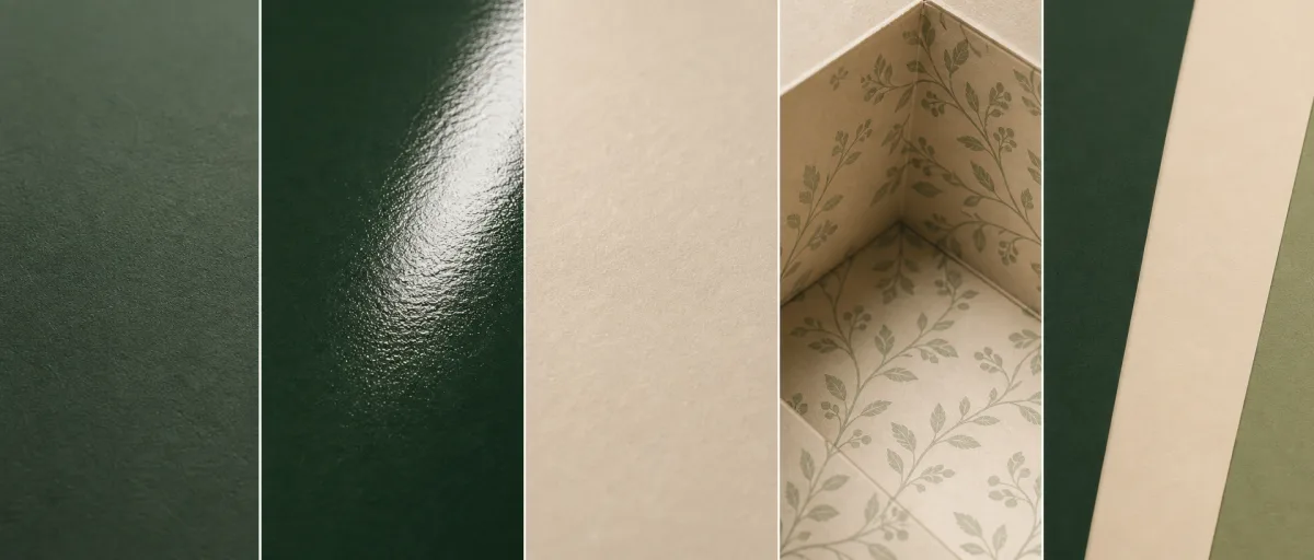
We use a physical sample on the intended paper for any finish that defines the design. We approve its position, coverage, depth, color, and tolerance. We keep an approved reference for production checks.
We approve a measurable reference, not a mood
We first decide what the sample must prove. A digital mockup can show placement. A generic swatch can show an available foil tone. Neither proves how the chosen artwork will transfer to the chosen carton. If the finish is small and familiar, a supplier swatch plus a printed proof may be enough for an early budget. If the effect is central to the pack, we ask for a production-equivalent sample. We view it in daylight, warm indoor light, and typical retail light. We check whether the finish pulls attention in the intended order. We inspect edges, filled gaps, missing transfer, dents, scratches, and changes near folds. We also handle the sample. A finish can look correct when untouched and then show fingerprints or rub marks after normal use. We write down acceptable limits and keep one signed reference.
We control cost by controlling area, tools, setup, and revisions. Foil and embossing normally need dies. Combined foil embossing needs closer registration and often a more complex tool. Spot UV needs its own screen or plate and a prepared surface. We do not expect a supplier to price a vague request such as premium gold detail with accuracy. We provide the finish layer, size, location, paper, quantity, and sample expectation. We also separate a must-have effect from optional versions. This makes quotation comparisons fair. If the budget changes, we can reduce area or move the effect to a smaller panel without losing the whole hierarchy. We would rather keep one well-made finish than spread a weak effect across every panel. That choice is simple, but it usually makes the pack feel more intentional.
Sources and Related Reading
- 1 Premium paperboard cartons. Internal material and finish options.
- 2 Folding cosmetic cartons. Internal structural context.
- 3 Sampling capabilities. Internal production workflow.
- 4 Request a packaging review. Internal guided inquiry.
- 5 Pantec hot-stamping artwork guide. External finishing artwork reference.
Conclusion
We choose one finish for one visual job, design it for the selected paper, and approve a physical reference before production.