
Print & Label Clarity guide
How Do We Keep Cosmetic Carton Text Clear of Folds?
Text can look safe on a flat file yet disappear around a corner. Once cartons are printed, moving the words may require a new production run.
We keep cosmetic carton text clear of folds by using converter-approved boundaries and checking the assembled panel at final size. We distinguish bleed from the safe area, confirm the drawing revision and review the exported production file after any placement change.
At Finer Pack, we use this review for secondary folding cartons. It focuses on where the copy lands after forming. Font size, legal content and language approval still need their own checks; a good panel position does not resolve them automatically.

Which Lines Define Where the Text Can Sit?
Bleed and safe-area guides can look similar in a busy file. Confusing them may put essential words in a cut, fold or covered overlap.
We identify cut lines, crease lines, glue areas and the converter’s safe boundaries on the current drawing. Bleed extends backgrounds beyond trim; it is not extra space for essential copy. We ask for project-specific placement limits instead of assuming one margin works for every carton.

We distinguish the background from the information area
We start with the converter-issued dieline for the actual carton size. We confirm its revision and scale before placing copy. We ask the converter to identify the cut and crease conventions, glue areas and any other restricted region. A colored line is useful only when everyone knows what it means. We do not infer the production instructions from a template found online, even if its outside dimensions appear similar to our proposed skincare carton.
Adobe explains bleed as artwork extending beyond the trim boundary so printed color can reach the edge after cutting. That is different from keeping essential words inside a safe region. We can let a background continue beyond a cut while keeping the product name away from that edge. We ask the print provider for its settings. We do not turn a generic software example into the required bleed or text clearance for this particular carton.
Esko describes structural artwork checks against cut, fold and glue boundaries. We use that distinction to map where information will remain visible after forming. We identify copy close to a vertical corner, tucked panel or covered overlap. We also mark any intentional graphic that wraps around a fold. The intent needs to be clear, because a background passing around a corner is a different decision from splitting a reading line across two faces.
We keep a small panel map with the artwork. It names the front, back, sides and opening direction in the assembled orientation. We ask for confirmation when a panel is unclear. This gives the designer a stable basis for moving a text block without silently changing its destination. We review the whole block, including punctuation and small symbols near its edge. A headline inside the boundary does not establish that the last line below it is also safely placed.
Sources for this section: Adobe: printer marks and bleeds1, Esko: packaging prepress process2, Finer Pack: artwork preparation4
Related decision: Prepare the complete production artwork
| Review point | What we compare | Approval record |
|---|---|---|
| Bleed | Background beyond trim | Print-provider settings |
| Safe boundary | Essential content location | Converter-approved limits |
| Panel map | Flat and formed orientation | Named faces and revision |
What Does an Assembled Proof Reveal?
A screen shows the blank without its corners. Words near a crease may look balanced there but become awkward to read on the formed carton.
We check a final-size assembled proof from the intended viewing positions. We confirm each text block stays on its assigned visible panel and compare it with the approved drawing. A paper mockup helps with orientation; representative board is needed when thickness or forming affects the placement decision.

We read the formed carton rather than the flat layout alone
We print the proof at its intended scale and verify that it has not been reduced to fit the page. We then form the carton using the approved layout. We compare each visible face with the panel map. We look for upside-down copy, a line that turns a corner and a word hidden by another part. This simple review can reveal orientation problems, but we describe it as a placement check rather than a production-quality sample.
We examine the carton at the positions in which a person would read it. We hold the front face upright, turn to the information panel and follow the copy in its intended order. We check the first and last lines near the corners. If a reviewer has to flatten the box to read a line, we record that behavior. We do not solve the problem by making the whole text block smaller without first considering its panel position.
In an r/Packaging discussion about checking custom artwork, the poster worried about logos and text near an edge after folding. Replies recommended making a physical mockup and asking about the actual board and converter tolerances. We treat that as a practical community question, not a survey of print failures. It reinforces our reason to inspect the formed pack. The thread does not establish a universal safe distance, and we do not use its comments as a technical specification.
We compare the paper proof with a sample made from representative board when thickness or forming changes what we need to judge. A thin printout may establish which face receives the ingredients block, while leaving the behavior at the corner unresolved. We label those limits clearly. We also inspect windows, overlaps and tuck areas that could hide information. When we move one block, we check nearby elements again so the correction does not simply move the problem elsewhere.
Sources for this section: Reddit: artwork before print3
Related decision: Review final-size readability and finishes
| Review point | What we compare | Approval record |
|---|---|---|
| Orientation | Every assigned face | Panel-by-panel result |
| Visibility | Corners and covered areas | Marked issue locations |
| Representation | Paper proof versus final board | Decision each can support |
How Do We Release the Corrected Placement?
A clear paper mockup can still leave the wrong PDF in production. When several files say final, the approved text position becomes difficult to trace.
We release one identified artwork version tied to the approved dieline and placement review. We check the exported PDF at final size and record who accepted the change. If the structure or copy changes later, we recheck the affected panels before carrying approval forward.
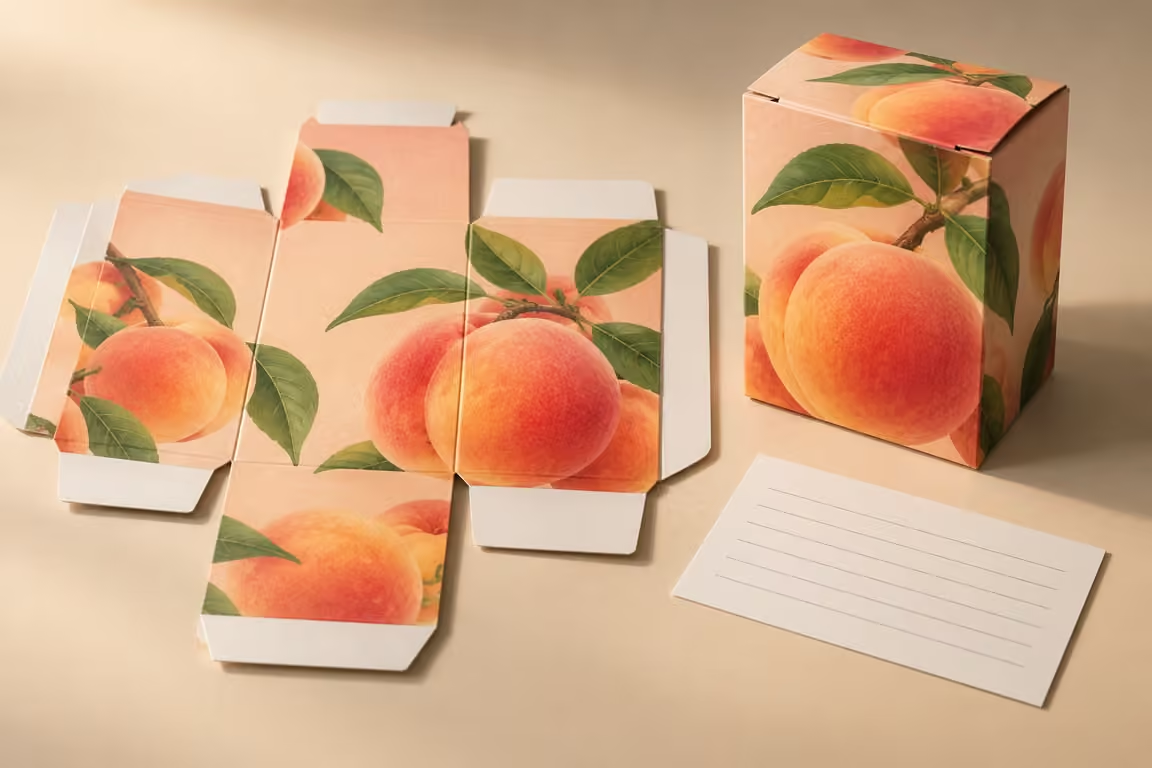
We connect the visible correction to the production file
We mark the exact change on the review proof and identify the file that contains it. We note the drawing revision, artwork revision and affected panel. We keep the request concrete, such as moving the full instruction block within the approved side-panel boundary. We avoid messages that say to give the text more room without showing which edge matters. A precise request lets the designer and converter check the same change and return a reviewable result.
We reopen the exported production PDF rather than relying on the design application alone. We inspect the affected block at final size and confirm that the relevant production boundaries still match the approved drawing. We also check that no temporary notes have become printable content. If the supplier has a preflight route, we ask for the relevant result and clarify its scope. A software pass does not replace the assembled placement review when that decision remains unresolved.
We coordinate placement with copy control. A translation can add lines, and a later symbol can use space that the designer thought was empty. We ask the responsible reviewer to accept the actual final text on the assigned panel. We do not remove required information simply to make the layout fit. The multilingual artwork guide covers version control in more detail. Here, we use its file discipline to make sure the position approval belongs to the text that will actually be printed.
We retain the approved proof and release record together. We identify any limited approval, such as a mockup accepted for orientation while final-board placement remains pending. If the carton dimensions, crease positions or text change, we name the affected review and repeat it as needed. We keep regulatory content approval separate from this mechanical check. Our result is a traceable placement decision, not a blanket promise that every label rule or reading condition has been satisfied.
Sources for this section: Esko: packaging prepress process2, Finer Pack: multilingual release5
Related decision: Control multilingual artwork versions
| Review point | What we compare | Approval record |
|---|---|---|
| File identity | Artwork and dieline revisions | One released version |
| Export check | Final-size production PDF | Accepted placement proof |
| Later change | New copy or structure | Affected panels rechecked |
Sources and Related Reading
- 1 Adobe: printer marks and bleeds. Primary software documentation; bleed and trim concepts, with provider-specific settings.
- 2 Esko: packaging prepress process. Primary prepress supplier; checks against cut, fold and glue boundaries.
- 3 Reddit: artwork before print. Community question about formed placement; anecdotes and supplier replies, not measured defect data.
- 4 Finer Pack: artwork preparation. Broader production-file preparation and review.
- 5 Finer Pack: multilingual release. Coordinate final copy and file versions before release.
Conclusion
We use the approved boundaries, read the formed carton and release one traceable file. We recheck placement when the copy or structure changes.