
Print & Label Clarity guide
How Do I Keep Cosmetic Cartons Readable With Premium Finishes?
A carton can look elegant and still hide the product name. We need decoration that helps the buyer find and understand the product.
We keep cosmetic cartons readable by giving essential information clear space and contrast, separating reflective decoration from critical text and checking each variant at final size. We review the printed sample under useful lighting and verify barcode performance separately.
We work through the information hierarchy, the variant system and the print approval so the design remains clear after production.

Which Information Should I Protect From Decorative Effects?
We can crowd the panel with finishes and leave the useful text hard to see. We need a clear information hierarchy first.
We map product identity, variant information and approved required copy before we place decorative finishes. We keep useful contrast and enough space around the text. We review market-specific label requirements separately, because a pleasing design does not establish compliance.
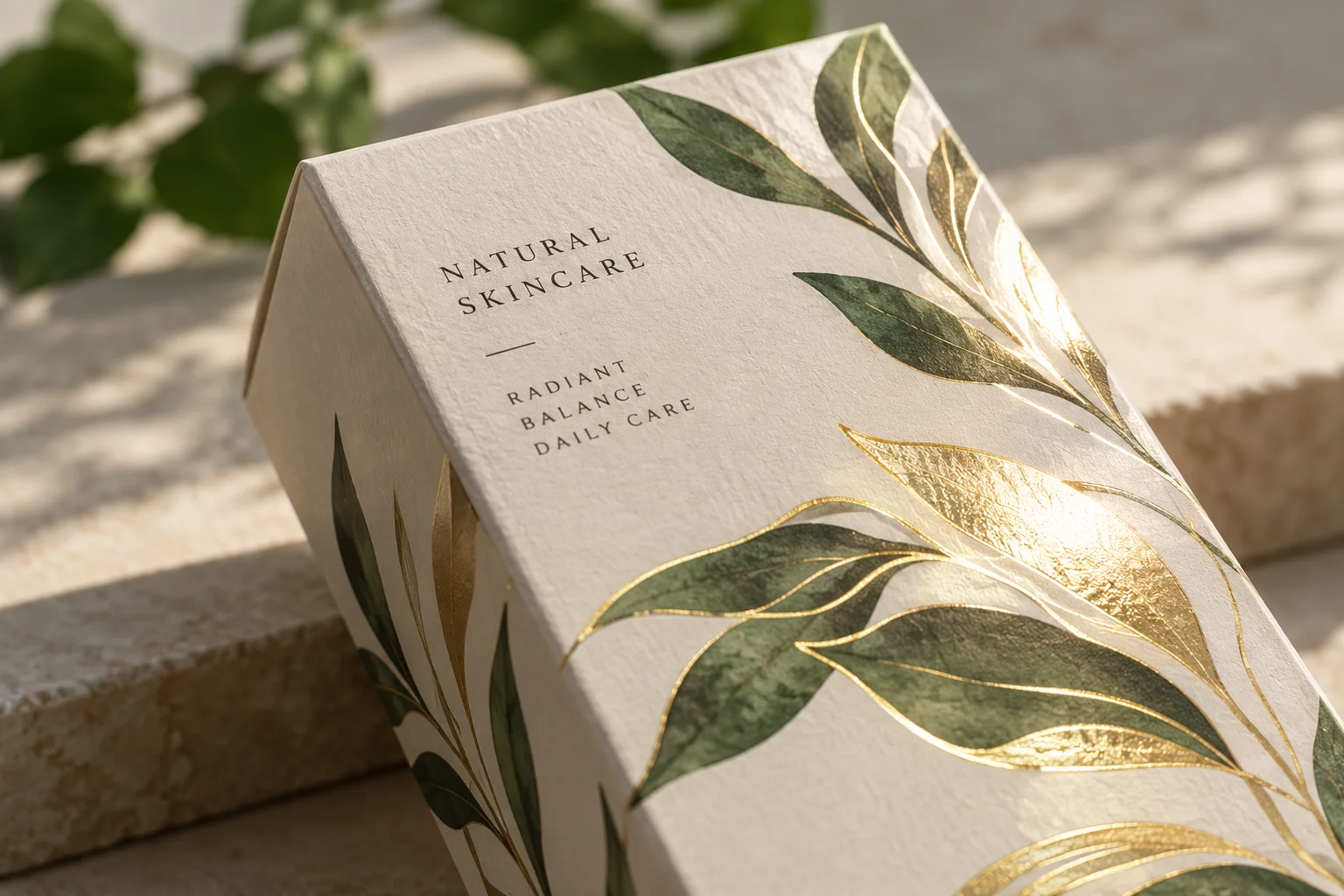
We reserve the reading space before the finish layer
We begin with the information the buyer needs to choose the product. We write the product name and the variant in the intended panel layout. We ask which information must be seen together and which panel is likely to face the buyer. We keep the approved copy in its correct version. We do not let a finish sample decide the label hierarchy after the design is nearly complete. We reserve the useful reading space first.
We then identify the copy that needs a separate compliance review. For U.S. cosmetics, the FDA's labeling guidance discusses prominence, contrast and clear placement of required information. We use that guidance to ask the responsible label reviewer about our product and panel. We do not apply one general font size to every statement or every market. We also keep cosmetic-only labeling separate from products that may have other regulatory requirements. We need approved copy and placement before we approve the print file.
We review where the finish belongs. We can place a foil motif or an embossed logo away from small product information. We compare its appearance on the intended paper and coating. We inspect the area in ordinary light, not only in a carefully lit product photograph. We watch for reflection that makes a line disappear when the box moves. We treat that observation as a design issue to solve with the actual sample, rather than a reason to reject every metallic finish.
We also read community design feedback with care. A Reddit cosmetics-packaging critique raises concerns about small text and variant identification. We do not treat the commenters as a regulatory panel or a customer survey. We use the feedback to test whether our own layout asks too much of a buyer. We would increase space, change contrast or move a decorative element when the sample makes the information difficult to read. We keep the design choice and the compliance approval clearly recorded.
Sources for this section: FDA cosmetic labeling guide1, Reddit cosmetics design critique3
| Decision | What we check | Approval record |
|---|---|---|
| Essential text | Hierarchy, contrast and clear space | Final-size artwork review |
| Required copy | Product and market requirements | Responsible label approval |
| Decoration | Reflection near useful text | Physical material sample |
How Do I Make Similar Skincare Variants Easy to Tell Apart?
A coordinated range can become a row of identical boxes. We need a system that makes the right variant easy to find.
We combine clear variant words with a consistent position and useful visual cues. We do not rely on color alone. We review the full range at final size and check how the cartons are matched to the products during packing.
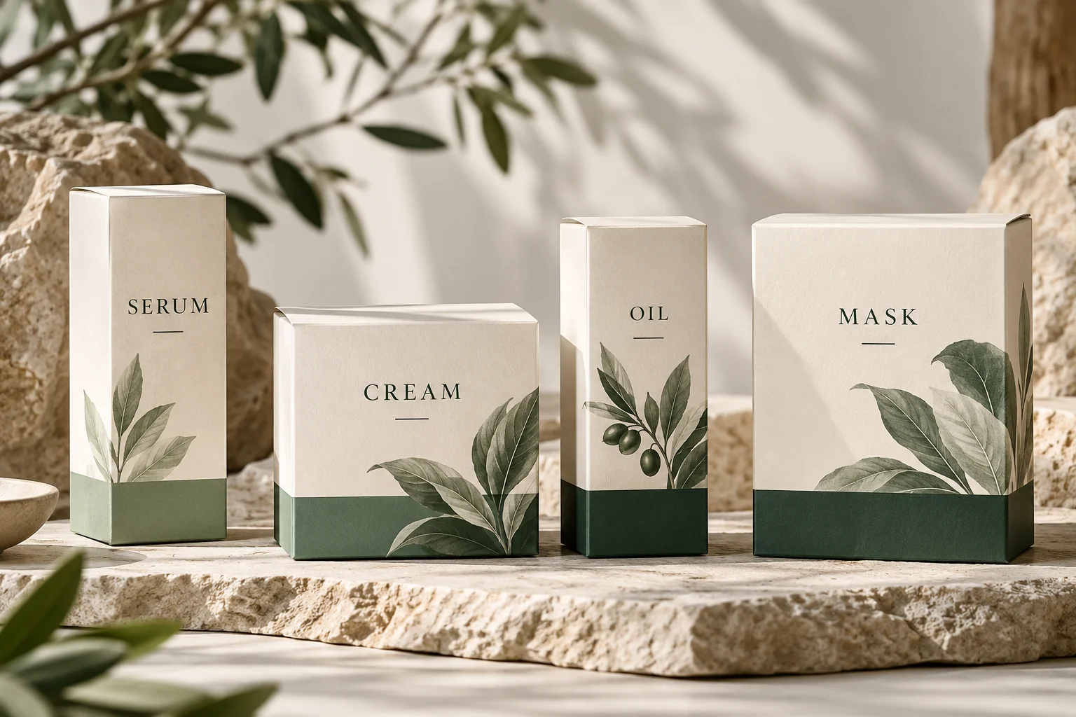
We test the range as a group
We start with all the cartons together. We place the full range in the expected retail or packing view. We ask whether the product name, variant and size are easy to compare across the panels. We keep their position consistent where the layout allows it. We do not judge a variant only from a single enlarged artwork file. We need the differences to remain clear when the range is seen at its actual size.
We then add visual cues that support the words. We can use a color band, a simple mark or a different panel detail. We keep those cues consistent with the brand, but we avoid making color the only way to identify the product. We think about mixed lighting and small pack sizes. We also think about a buyer who does not recognize the brand’s color code. We want the printed variant name to carry the decision without requiring an explanation.
We review production and fulfilment as part of the system. We ask how the team will match each carton to its filled product. We keep SKU references and approved artwork versions organized. We check a complete set of printed samples, rather than approving one variant and assuming the others are equivalent. We look for a name change that lengthens a line or a color change that reduces contrast. We review whether the finish position stays clear of the updated information.
We also check the online presentation. We ask whether the main product photograph shows the variant words and whether the written listing uses the same name. We do not assume a carton has to solve every small-screen problem, but we avoid a mismatch that creates unnecessary doubt. We keep the physical range review and the listing review as separate tasks. We use Finer Pack’s artwork support to ask about layout and print-file readiness. We leave product claims and legal copy approval with the responsible brand team.
Sources for this section: Finer Pack artwork support4
| Decision | What we check | Approval record |
|---|---|---|
| Variant words | Clear names and consistent location | Full-range sample |
| Visual cues | Support beyond color alone | Lighting and size review |
| Packing match | SKU and artwork references | Version-controlled range list |
What Should I Check on the Printed Carton Before Approval?
A bright screen can hide print and glare problems. We need a final-size sample that reflects the selected materials.
We check text, contrast, folds and finish placement on the intended substrate at final size. We review the complete variant range and barcode location. We arrange barcode verification using the relevant specification, because a successful phone scan is not a print-quality report.
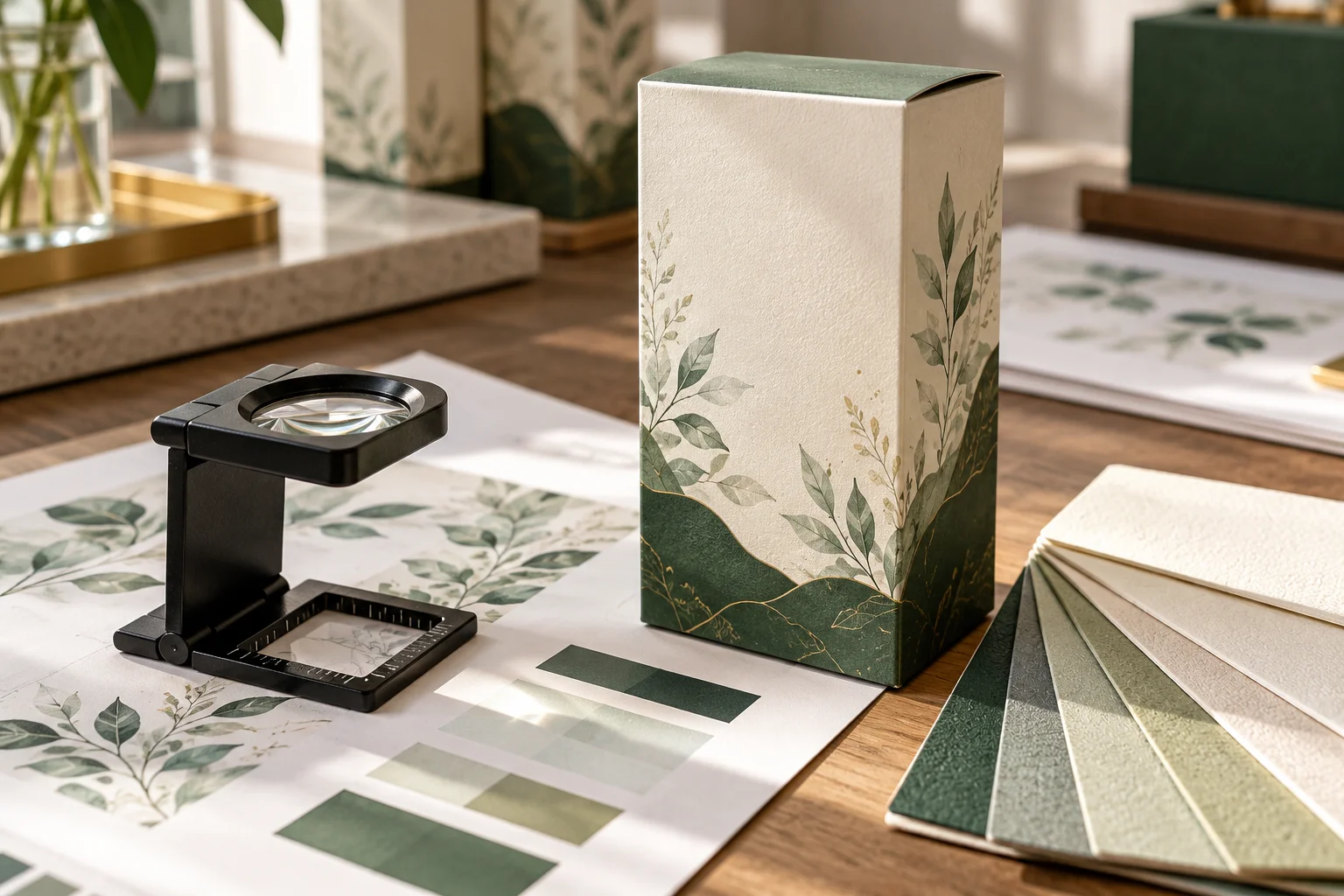
We use separate checks for people and scanners
We first inspect the printed information with the carton assembled. We read the product name and the smaller approved copy in normal handling positions. We check whether a fold interrupts a line or a closure covers a useful area. We look at the print near an embossed or foil feature. We compare the sample with the approved artwork version. We do not accept a sharp flat sheet as the only evidence for the assembled carton.
We then review the sample under lighting that represents the intended use. We move the carton and watch the reflective areas. We ask another person to identify the product and variant without coaching. We record any confusion and review the layout before approval. We treat this as practical design feedback. We do not claim it covers every visual need or replaces the applicable label requirements. We keep the responsible label review as a separate approval in the project file.
We check barcode decisions separately from human reading. GS1's implementation guidance explains the importance of contrast and clear quiet zones. We avoid placing decorative print into the space the symbol needs. We review the chosen location against folds and other packaging features. We use the relevant GS1 specification and a suitable verification route for the symbol. We do not describe a quick phone scan as proof that the finished print will scan reliably through the whole supply chain.
We finish by retaining the useful reference set. We keep approved print files, a physical sample and the variant list together. We note the paper and finish combination used for approval. We ask what needs re-review when a material, finish or label version changes. We can use Finer Pack’s sampling route to request the appropriate print or production-representative sample. We want the final approval to show what was checked and which questions still belong to the brand, supplier or verification specialist.
Sources for this section: GS1 barcode implementation2, Finer Pack print sample planning5
| Decision | What we check | Approval record |
|---|---|---|
| Human reading | Assembled text and lighting | Final-size sample notes |
| Barcode | Contrast, clear space and location | Relevant verification record |
| Reorder | Artwork, material and finish version | Retained approval references |
Sources and Related Reading
- 1 FDA cosmetic labeling guide. U.S. primary guidance on prominence and conspicuousness; market and product scope still need review.
- 2 GS1 barcode implementation. Primary guidance on barcode contrast and quiet zones; not a test report for the illustration.
- 3 Reddit cosmetics design critique. Community critique of readability and product distinctions, not a measured preference study.
- 4 Finer Pack artwork support. Internal artwork and production capabilities.
- 5 Finer Pack print sample planning. Internal route to sample decisions.
Conclusion
We keep premium cosmetic cartons clear by protecting essential text, testing the full range and approving human reading and barcode quality through separate checks.