
Color control guide
How Do I Keep Cosmetic Packaging Colors Consistent Across Reorders?
A familiar beauty color can drift when a team approves a screen, changes board, or treats a past carton as an undocumented reference.
We keep cosmetic packaging color consistent by approving one physical standard for one specified construction. We record the board, print process, finish, viewing condition, and version. We then compare a new proof and reorder sample to that approved reference instead of relying on a screen or a color code alone.
We use these three questions to turn a brand color into a practical production reference that a buyer, printer, and packaging team can review together.

What Belongs in a Packaging Color Standard?
A name, HEX value, or old carton can leave a printer guessing which material, process, and viewing condition a buyer meant.
We make one approved physical reference for each pack construction. We record the color, carton board, ink method, finish, approved sample version, and review condition. We keep this set with the artwork and purchase record so a later printer can see the decision rather than interpret a vague description.
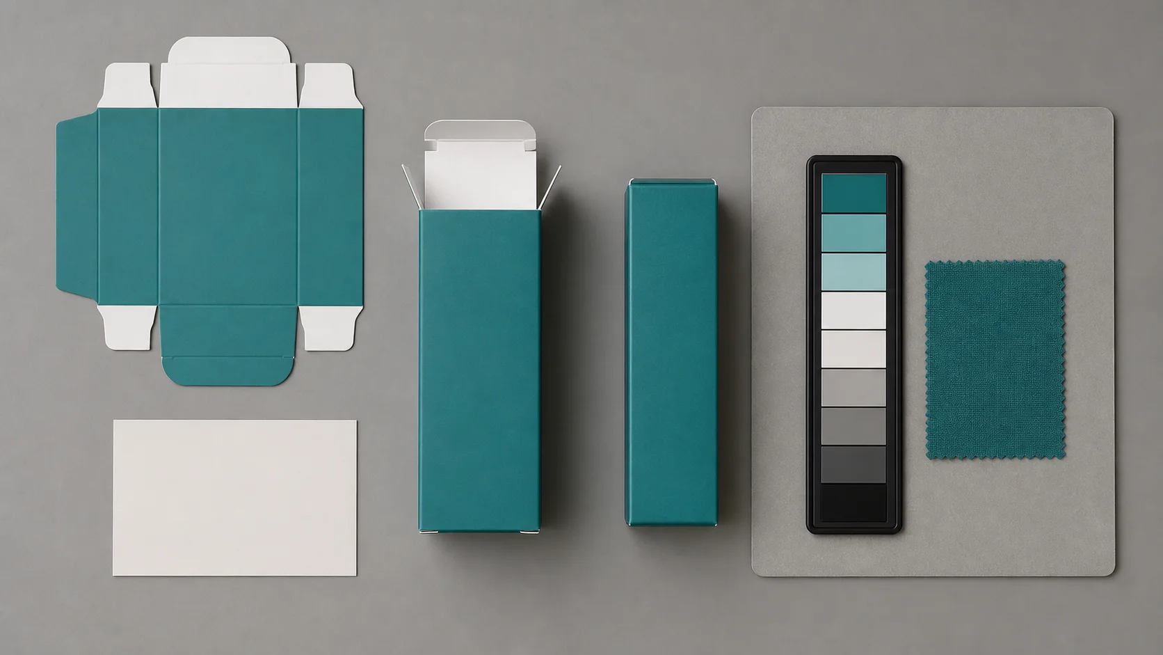
We make the reference describe the real pack
We begin with the finished packaging component. We identify the SKU, dieline revision, finished size, board description, print sides, print process, coating, and any foil or varnish. We then attach the physical color reference that the buyer approved. It may be a press proof, a production-equivalent sample, or a controlled drawdown on the intended board. We do not call a computer screen the master standard. A screen is useful for discussion, but its appearance depends on the device and settings. The International Color Consortium explains that output profiles describe the relationship between device values and a standard color space. It also explains that a printer profile is valid for the substrate and inks used to make it. That is why we connect the color decision to the actual carton construction instead of treating one digital value as a guarantee for every material.
We record the decision in simple language. We note whether the target is a process build, a specified spot color, or a prior approved sample. We state whether the comparison happens under an agreed viewing setup and whether the buyer expects a close visual match or a measured tolerance supplied by the technical team. We also identify the owner who can release a variance. Pantone notes that print variation can occur between printings and within a printing, so we do not promise that a named color removes every production variable. We use the name or code as part of the brief, then make the physical reference and construction the review point. This gives a new printer enough context to raise a real question before production rather than silently convert an unclear target.
| Reference item | What we record | Why it matters |
|---|---|---|
| Physical approved sample | Version, date, and component | Gives the team one visible target |
| Carton construction | Board, print sides, coating, and finish | Prevents a color target from floating between materials |
| Color definition | Process build, spot reference, or approved sample | States how the printer should interpret the target |
| Release rule | Reviewer and variance path | Stops informal approval from becoming the standard |
How Do Board, Ink, and Finish Change the Color?
The same artwork can look different when the board white, ink system, coating, or surface texture changes beneath it.
We review color on the intended board and finish, not only on a generic proof. Coated and uncoated paper show ink differently, and a printer profile relates to one substrate and ink set. We compare alternatives side by side before we approve a construction or print-method change.

We test the color where the customer will see it
We place the intended material next to the approved reference. Pantone identifies coated and uncoated guides by the paper type that affects the color appearance. We use that as a practical reminder that board is not a neutral background. A bright coated board, a warmer uncoated board, a textured sheet, or a board with optical brighteners can change the way an ink area appears. We do not assume that a color approved on a smooth white proof will look the same on a natural carton. We request samples that match the construction decision: the board, print process, color coverage, coating, and key finish. If a launch needs a foil, varnish, or laminate, we include it in the visual review because it can change neighboring contrast and gloss even when the ink build stays the same.
We also keep design intent separate from production method. A brand can specify a color family, but the printer needs to explain the proposed process and material. The ISO 12647 family covers process control for proof and production prints, including parameters and measurement methods. We do not claim that citing the standard makes a specific carton compliant. We use its logic: identify the printing condition, compare like with like, and agree how the proof represents production. When a supplier proposes a different board or a different process, we treat it as a new comparison, not a minor paperwork change. We place the approved and proposed samples together under the agreed review condition. Then we ask a plain question: does the proposed pack still meet the visual target for this SKU? This method gives the buyer a basis for choosing the closest workable result or changing the artwork before the run begins.
| Variable | What we compare | Decision before release |
|---|---|---|
| Board | White point, coating, texture, and opacity | Use the intended carton board for approval |
| Ink method | Process build or specified spot approach | Confirm how the target will be reproduced |
| Finish | Varnish, lamination, foil, or matte surface | Review it with the printed color, not separately |
| Proof path | Proof condition and production condition | State what the proof can and cannot represent |
How Do I Approve Color for a Reorder?
A reorder can drift when the team sends an old file without the approved reference, current material, and clear release rule.
We treat a reorder as a controlled comparison. We send the approved construction and reference, request a proof or sample that represents the proposed run, and review it against the same target. We document the result, any accepted variance, and the artwork or material version before we release production.
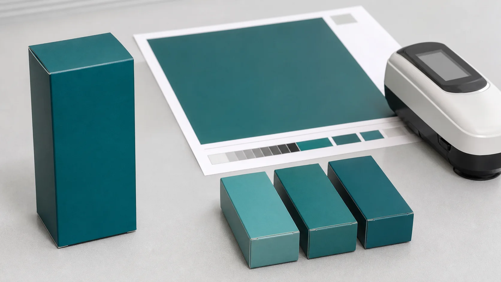
We compare the reorder instead of trusting memory
We reopen the previous record before we send files. We check the carton size, board, printer, process, coating, inks, and artwork revision. We ask the supplier to flag changes before it starts a new run. A change can be sensible. A board may be unavailable, a printer may propose a different process, or a finish may need adjustment. The important point is that the buyer sees the change as a new decision. In a Reddit discussion about matching existing packaging, a practitioner described a color problem after a printer change. We use that as attributed community insight, not as technical proof. The lesson is practical: a former pack can help, but it does not replace a written construction and a new controlled comparison when the supply path changes.
We arrange the comparison with the approved physical reference, the proposed proof or sample, and the relevant carton component. We look for a meaningful visual difference, then ask the technical team to use the agreed measurement method when the job requires one. We do not invent a universal Delta E limit because the acceptable tolerance, method, material, and viewing condition belong to the agreed specification. We capture the outcome in the order record: approved, approved with a documented variance, or not approved. We save photos as supporting context, but we do not let a phone photo become the master color reference. After release, we keep a retained approved sample where the team can find it for the next reorder. This simple chain makes the next decision faster and keeps a brand color from depending on one person's memory of a past carton.
| Reorder step | What we send or check | Record we retain |
|---|---|---|
| Confirm construction | Current board, finish, process, and artwork | Change list or confirmation |
| Request comparison | Approved reference plus proposed proof or sample | Sample identification and date |
| Review | Same target and agreed viewing condition | Approval, variance, or rejection |
| Release | Final authorized version | Retained approved sample for the next run |
Sources and Related Reading
- 1 Premium paperboard cartons. Internal carton options for a color-managed packaging brief.
- 2 Finer Pack capabilities. Internal sampling and production-development context.
- 3 Start a color-control brief. Internal route for sharing artwork, board, finish, and reorder requirements.
- 4 Pantone printing color variances. First-party guidance that notes normal variation between and during printings.
- 5 ISO 12647-1 process control. Official standard overview for process-control parameters and measurement methods for proofs and production prints.
- 6 ICC profile FAQ. International Color Consortium guidance on printer profiles and their substrate-and-ink dependency.
- 7 Reddit packaging color-matching discussion. Attributed community discussion about a color mismatch after a printer change; not a factual authority.
Conclusion
We define one real-pack standard, review material changes visibly, and release each reorder only after it compares clearly with the approved reference.