
Structure guide
How Do I Choose the Right Box Structure for a Skincare Line?
A beautiful box can still fail when it crushes, wastes space, or makes a glass bottle hard to remove.
We choose a skincare box from the primary container, sales channel, and protection need. Folding cartons suit efficient retail units. Rigid boxes suit presentation-led sets. Corrugated mailers protect direct shipments. We confirm dimensions, weight, insert needs, and packing steps before artwork starts.
We use the next three questions to move from a visual idea to a structure that can be sampled, packed, shipped, and reordered with fewer surprises.

What Must I Measure Before I Choose a Skincare Box?
A structure chosen from a photo can look correct and still leave a pump exposed or a bottle loose.
We record the finished product length, width, height, weight, fragile parts, and packing direction. We also note the tolerance around caps, pumps, and labels. These facts define the cavity, board load, closure, and insert before we compare box styles.
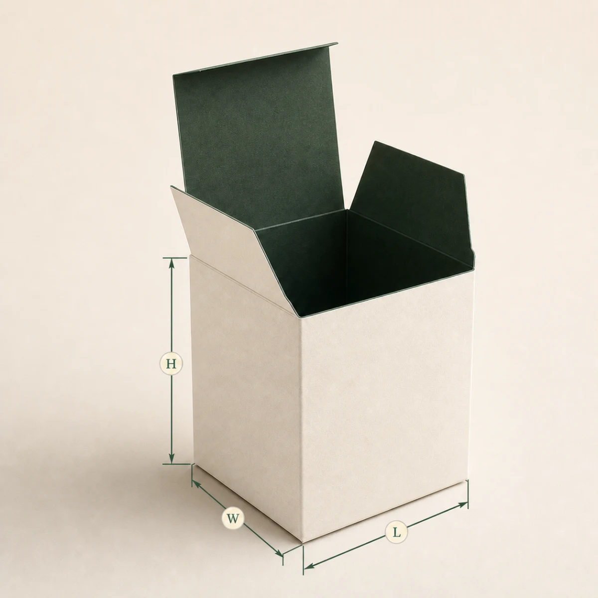
We start with the packed object, not the empty box
We measure a production unit whenever one exists. A drawing can miss a flexible tube shoulder, a dropper bulb, or a label seam. We measure the largest real sample and keep the measurement method consistent. We also record weight. Weight changes how a base panel bends and how an insert holds its shape. A tall glass bottle creates a different load from a short cream jar, even when both use similar outer volume. We then decide the product direction. A bottle packed upright needs support around its shoulder or base. A jar may need finger space so a customer can lift it without turning the whole box upside down. We treat this access space as a design input, not wasted space. We also check whether the primary container can leak, scuff, or react to rubbing. These risks shape the choice of paper insert, molded pulp, divider, or simple carton wall.
We write the tolerances beside the nominal dimensions. A rigid cavity with almost no clearance can become impossible to pack when bottles vary by a small amount. A loose cavity can make the product rattle and damage the opening experience. We normally ask for a white sample around the real product before we approve final artwork. We close it, shake it gently, stack it, and ask another person to remove the product without instructions. We watch where they pull and where the board bends. This small test often shows more than a polished render. It also creates a stable dieline for the designer. If the product is still changing, we do not pretend that the cavity is final. We mark the dimension as open and delay detailed panel artwork. That choice can feel slow for one day, but it prevents a full artwork reset later.
Which Box Structure Fits My Sales Channel?
The same skincare set can face shelf pressure, parcel drops, or gift expectations, so one structure rarely wins everywhere.
We use folding cartons for efficient retail units, rigid boxes for controlled premium presentation, and corrugated mailers for direct shipping. We combine structures only when each layer has a clear job. The sales channel decides the handling risks and the opening moment.
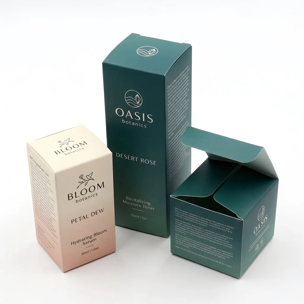
We give every packaging layer one clear job
We begin with what happens after production. A retail carton may pass through a packing line, a master carton, a stockroom, and a shelf. It needs clear panels, stable stacking, and a closure that survives repeated handling. A direct-to-consumer order meets a different path. It can move through sorting belts, drops, compression, rain, and doorstep handling. A beautiful folding carton alone may not be a shipping container. We use a corrugated mailer or shipper to manage that route. A rigid box gives a slower reveal and strong presentation for a gift set, but it adds board, wrap, labor, and shipping volume. We choose it when the experience supports the product value. We do not choose it only because a competitor used one. When a product sells through several channels, we try to keep the primary retail pack stable and change the outer shipping system. This approach protects artwork consistency and avoids rebuilding every SKU.
We also consider how a warehouse worker packs the order. A sleeve and tray can look refined, but it may slow assembly or slide open without a seal. A magnetic box can be reusable, but magnets add separation and recovery questions. A mailer with a fitted paper insert can reduce movement, but only if the insert fits the real order mix. We map each component to a task: contain, protect, present, inform, or ship. If two layers do the same task, we ask whether one can go. If no layer manages a clear risk, we do not add it for visual fullness. We then sample the complete packed system. This means the product, primary pack, insert, mailer, closure, and any label all appear in the test. We can then compare protection, packing time, cube, and customer access with evidence instead of taste.
| Structure | Best starting use | Main decision |
|---|---|---|
| Folding carton | Single retail unit | Board, closure, and insert need |
| Rigid box | Gift set or premium launch | Presentation value versus volume |
| Corrugated mailer | Direct shipment | Flute, fit, and transit route |
| Sleeve and tray | Controlled reveal | Assembly and sliding fit |
When Should I Approve Finishes and Artwork?
Early decoration can lock a team into panels that move after the fit test, which creates rework and missed details.
We approve the structure and product fit before final artwork. We then test print, foil, embossing, coating, and color on the intended board. This order keeps visual decisions tied to stable panels and realistic production limits.
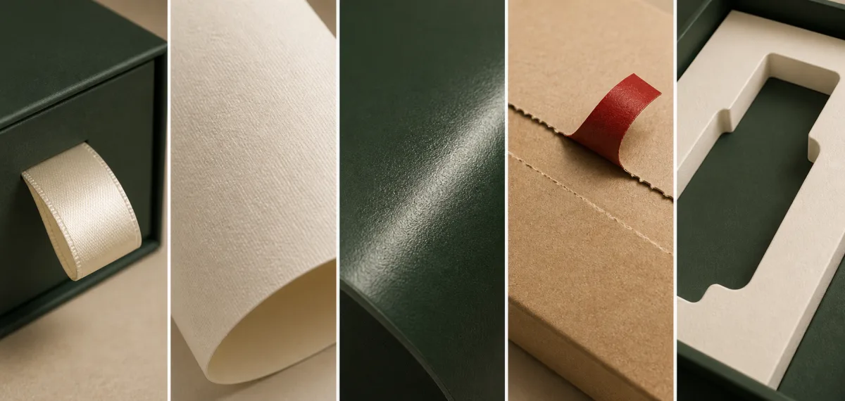
We freeze geometry before we polish the surface
We treat the dieline as a technical map. Cuts, scores, glue areas, bleed, and safe zones all affect the design. If the structure changes after the designer builds the artwork, the front panel may become a side panel and a foil mark may move onto a fold. We avoid this by approving a numbered structural sample first. We photograph the sample with the product inside and record every open issue. We also ask how the pack will be oriented during filling and on shelf. Once the geometry is stable, we place the information hierarchy. The brand mark, product name, legal copy, batch area, and opening cues need clear positions. We keep fine artwork away from scores and cuts. We also leave room for normal registration tolerance. A screen mockup hides these physical limits, so we review the design at finished size and on a printed proof.
We choose finishes after the paper and print method because the same foil or coating behaves differently on smooth, textured, coated, and uncoated sheets. A deep emboss can weaken a small panel. A large foil area can show pinholes or uneven transfer. A dark solid print can reveal rub marks. We ask for a sample that matches the decision we need to make. A white dummy can approve fit but not color. A digital proof can check layout but may not match offset color or production foil. A production-equivalent sample costs more because it uses closer materials and tools, but it is useful when a finish defines the launch. We record what the sample proves and what it does not prove. This simple rule keeps a team from approving color from a structural mockup or approving fit from a render.
Sources and Related Reading
- 1 Folding cosmetic cartons. Internal structure and material options.
- 2 Magnetic gift boxes. Internal rigid presentation options.
- 3 Printed e-commerce mailers. Internal direct-shipping options.
- 4 Finer Pack capabilities. Internal sampling and production context.
- 5 ISTA test procedures. External reference for packaged-product testing.
Conclusion
We choose structure from product facts and channel risks, approve physical fit first, and add finishes only after the packaging system works.